The SCAI logo with the heart icon and name lock-up is our default logo. This version of the logo should be used for most marketing and communications materials.
Primary Logo
![]()
Horizontal
![]()
Vertical
Logo Variations
The SCAI logo is flexible and can be used in both horizontal and vertical layouts. Ultimately the version that fits the space better should be used.
Logo Variation in Order of Preference
- Primary (shown above): Horizontal or vertical full name logo
- Secondary (shown below): Horizontal or vertical acronym logo
Secondary Logo
![]()
Horizontal
![]()
Vertical
Logo Mark
The SCAI symbol can be used on its own to represent the brand in places where very little space is available, such as on social media or on certain product placements.
![]()
Single Color Logo
The preferred usage of the SCAI logo is in full color where applicable. Each logo version has single-color variants as well. As necessary, the logo can appear in black or knocked out to white over any of the brand colors that provide sufficient color contrast.
Logo Clear Space
When placing our logo in a document, it is important to leave the correct amount of space around the logo in order to maintain legibility.
Leave a minimum space around the logo, enough to differentiate it from the items surrounding it.
![]()
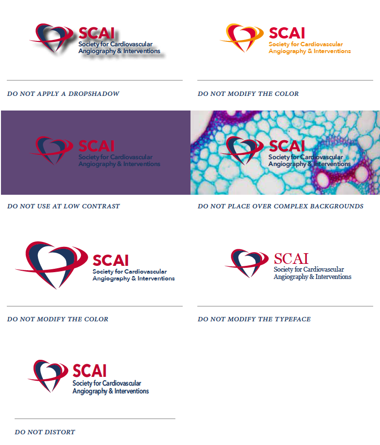
Logo Incorrect Use
Our logo is our signature, proper and consistent use is a hallmark of clarity and integrity of our name and image.
Here are a few examples of what not to do.
Use the link below to download the primary SCAI logo in color, black, and white. If you need the secondary or heart logo mark versions, please email [email protected]. The files are formatted in eps, pdf, jpg, png, and svg formats. Please follow the above guidelines when using the SCAI logo.